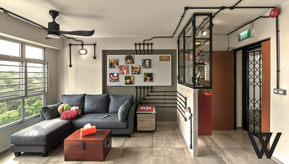
Due to the excellent equilibrium between price and space, 3-room flats are one of the most popular HDB flat options for young couples ready for a BTO. It may appear to be a small flat, but this adaptable space can be opened up and given a completely different atmosphere! Expert interior designers share some of our best ideas for creating a beautiful 3-room BTO design!
Make space.
Let’s begin by addressing the most pressing issue: space. The new BTO apartments are smaller than the older resale flats; therefore, space-saving solutions are crucial. This is where interior designers come in to help; they specialise in making a space appear larger by maximising the functionality and convenience of every square foot.
Creating custom storage is one of the most vital aspects of interior design. For example, a wall divider is transformed into a vertical wine rack that does not add mass to the room and adds an intriguing design element to the home!
Transparency is critical.
A common interior design strategy is to have an open floor plan, which may entail demolishing walls and avoiding doors or surfaces that separate rooms. However, if you still want to restrict where one room ends and another begins, partial glass fixtures or wall cladding can provide this without reducing your space.
Using streamlined metal and glass panel structures, for instance, you can visually separate the kitchen from the vanity area without adding mass or dividing the room. In addition, a monochromatic colour scheme extends to the remainder of the vanity and shower, giving the area a streamlined, uniform appearance.
Colour your zones.
Using colour is an additional method for dividing your home’s spaces. Thus, for example, the conclusion of the entrance area where shoes are left is plainly visible. However, because this space is delineated with colour, your eyes can still move freely throughout the remainder of the room, making it appear and feel much larger.
The transition from the black and white entryway to a brown and white colour scheme is seamless because white is used in both areas to create a common motif. However, the warmth of the brown wooden fixtures produces a unique and cosier atmosphere within this compact space!
Cosy corners.
It is essential to make the most of the space in your 3-room BTO design, and corners are an often-overlooked area with surprising potential! For instance, you can install an off-white suspended hammock chair that complements the well-appointed wall shelf, giving you the ideal opportunity to take a break or curl up with a book you’ve been eager to read.
Having such a large fixture in this space instantly makes this once-seemingly tiny nook feel much larger, and by having all the fixtures in a light colour scheme, your space feels more open, spacious, and cheerful.
